
5 Easy Steps to Plot Occurrences of Dates v/s Week Number in Google Sheets
How to plot occurrences of dates v/s week number in Google Sheets
Split the Datetime string to Date and Time
- Let’s say your dataset contains data in DateTime format, as shown below:

- Use the SPLIT function to separate it to date and time, as shown below:
=SPLIT(A2,” “)
- Apply the formula to all the cells of your dataset.
- The output will be as shown below:

Use the WEEKNUM function to categorise dates to a week
- The WEEKNUM function returns a number representing the week of the year where the provided date falls.
- Use the function, as shown below:
=WEEKNUM(B2)
- Apply the formula to all the cells of your dataset.
- The output will be as shown below:

Create a PIVOT Table
- Before creating a pivot table, ensure that the rows in focus are adjacent to each other, as shown below:

- Select columns Week and Registration Created At.
- Go to Insert → Pivot Table.

- Verify the data range and click Create.
- A PIVOT table will be created on a new sheet.

Select Columns and Values of the PIVOT table
- Go to the Columns option in the Pivot table editor.
- Select Week Number.
- Unselect Show Totals.
- Go to the Values option in the Pivot table editor.
- Select Registration Created At.
- Summarise values by COUNTA as shown below:

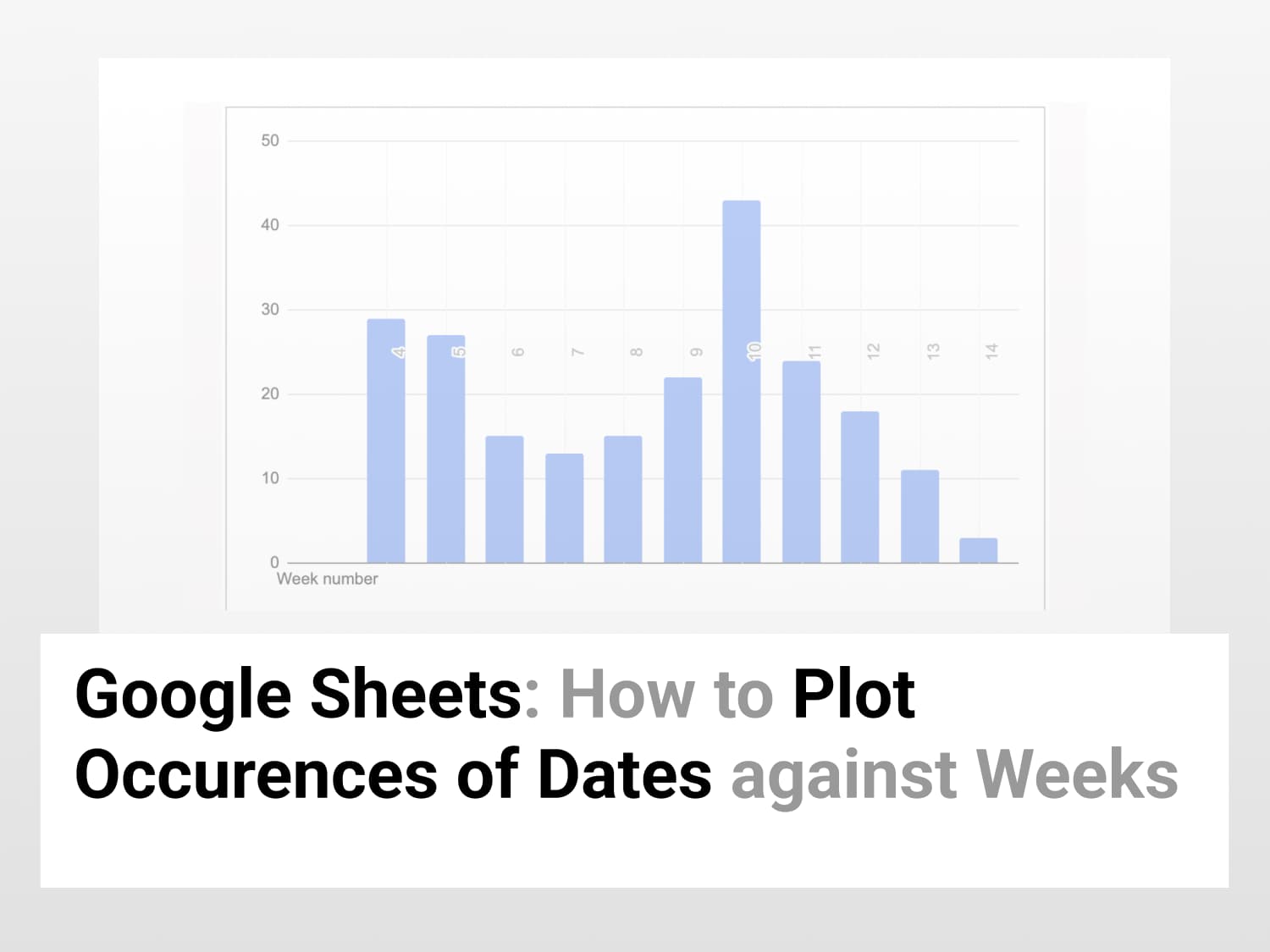
Insert Chart to visualise the trend of occurrence of Dates against Week number in Google Sheets
- Select the entire pivot table which is created.
- Go to Insert → Chart.

- A bar graph is created.
- Go to Chart Editor.
- Go to Setup.
- Select the option Switch rows/columns, as shown below:

- Remove the A2:M2 range from the Series tab, as shown below:

- Add label to identify week number against occurrences of that particular week, as shown below:

- The final output will be a bar graph representing the trend of occurrences of registration dates of a particular week across months.

See Also
Most Commonly Used Google Script Functions for 2022: Learn about widely used advanced script functions.