Quick Guide:
How to create an organizational chart in Google Sheets:
1. Enter the designation and the superiors they report to in separate columns
2. Select the data>Insert>Chart>Organizational chart
Click here to get a copy of the sample Google Sheets template and follow the example in the tutorial below.
Organizational charts have been around for as long as most of us can remember. If you have ever worked in a corporate setting, chances are that you have probably seen or created one. It is an essential business tool.
Uses of organizationa chart
An organizational chart is a visual representation of the relationship between employees or offices in a given organization. While there are several kinds of organizational charts and different uses for them, they are popularly used to depict hierarchy within a system.
Beyond that, they are useful for reasons which include :
- They can help in enforcing a line of communication.
- They can help organizations in making budgeting plans.
- They can help in solving staffing issues.
In this tutorial, we will learn how to easily create an organizational chart in Google Sheets.
How to create an organizational chart in Google Sheets
Creating an organizational chart in Google Sheets is a straightforward process neatly summed up in about 3 steps:
Step 1 – Entering our data
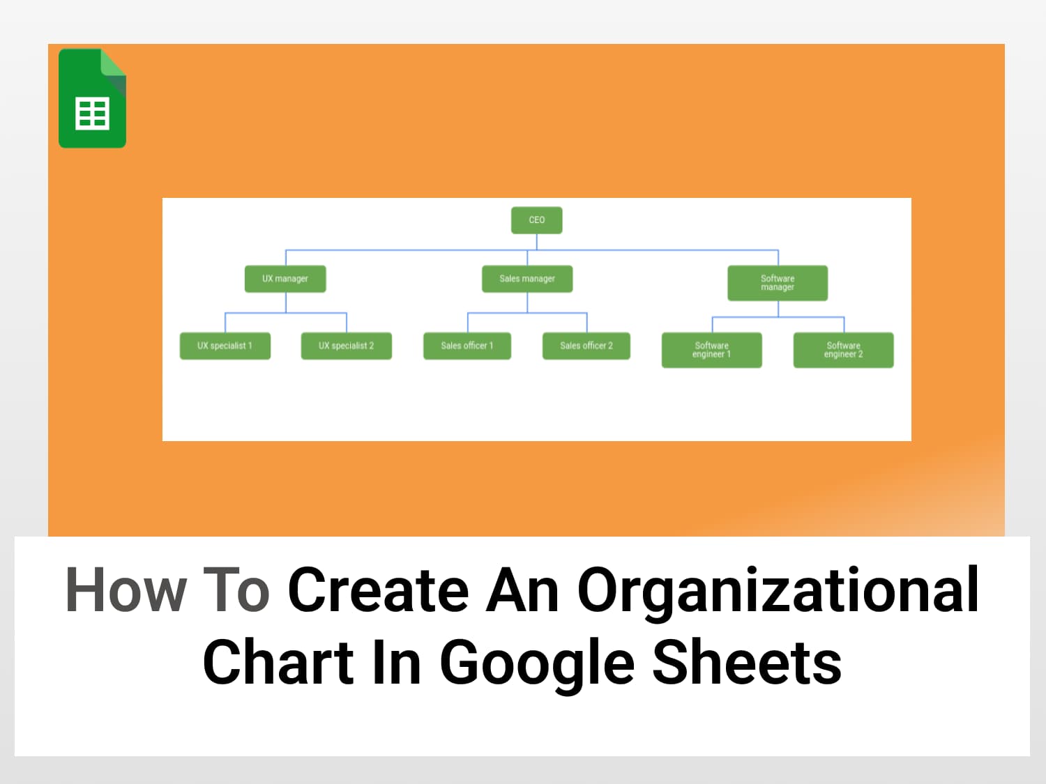
Every chart requires some sort of data. The ORG chart in Google Sheets isn’t an exception. For the sake of this tutorial, I will be using a chart to represent the positions in a hypothetical software development company. The goal is to depict the hierarchy from the top officer to the lowest ranking employees.
To get started, we fill the cells with appropriate data.

We have set up the data in a way that ensures every designation in the company has a direct superior they report to. While at the top, there is an office that everyone directly or indirectly reports to. This is known as a hierarchical structure and it’s used for hierarchical organizational structures.
Step 2 – Creating a chart:
To illustrate our data in a visual format, Google Sheets offers us an Insert option.

The insert menu pops up when clicked showing us various components we can utilize. Since what we need is a kind of chart, we click Chart.
Step 3 – Setting up the organizational chart in Google Sheets
On clicking Chart, a Column chart is automatically selected. Since this is not the type of chart we need, We scroll to the bottom of the chart editor to find the organizational chart option.

Our data is immediately rendered in a pictorial format while maintaining the hierarchical arrangement we specified.

It is really that simple, we have successfully created a chart for our corporate structure.
Google Sheets also makes room for editing the chart, we can do things like change the colour, text size, and arrangement of data in our organizational chart. Let’s take a look at how.
Customizing the organizational chart in Google Sheets:
To customize our organizational chart, we simply open the chart editor by clicking on the 3 dots in the top right corner of the chart.

The chart editor has two tabs – Setup and Customize.
In the Setup tab, we can perform tasks like:
- Converting our chart to a different one.
- Switching rows/columns.
The Customize pane is where we can change the visual appearance of the chart. Google Sheets offers us two customization features, We can :
- Change the colour of the chart.
- Change the box and text sizes.

Changing the size: To change the size of the blocks and text in our organizational chart, we start by clicking on the drop-down menu labelled Size. The available options are Large, Medium, and Small.

Changing the colour: Similarly, we can change the colour by clicking on the drop-down menu labelled Node colour. A node refers to a block in the chart.

By clicking on a colour, we change the appearance of the entire chart to the colour of our choice.
Another thing we can do with our organizational chart in Google Sheets is to change the colour of a single node when it is clicked. This can be useful if we want to highlight specific nodes in the chart.

Conclusion
Organizational structure charts are important for businesses/organizations seeking a way to represent their structure visually, but sometimes having to create them might appear daunting. As this tutorial has demonstrated, the organizational chart in Google Sheets is an excellent tool that you can use to do this with great ease.
See also:
You might find some of our other articles on general Google Sheets usage interesting, check them out:
https://blog.tryamigo.com/gantt-charts-in-google-sheets/
https://blog.tryamigo.com/tree-map-charts-in-google-sheets/
https://blog.tryamigo.com/how-to-create-a-funnel-chart-in-google-sheets/