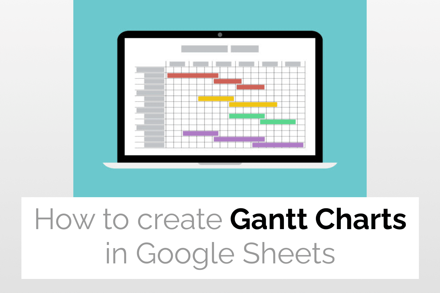
Introduction to Gantt Charts in Google Sheets
A Gantt Chart is a horizontally laid bar chart that contains information about the schedule of a project. A Gantt Chart represents the project schedule in the form of small tasks displayed against some time duration. Hence Gantt Charts in Google Sheets can be used to visualize project schedules, monitor the project progress and also share the information with the involved team members.
Project Managers use Gantt Charts in Google Sheets extensively to plan and manage workstreams across various ongoing business processes. Gantt Charts in Google Sheets are also especially useful to easily find bottlenecks that could impede a project’s progress in Agile projects.
Example Data
The below spreadsheet consists of the following project data details-
- Task
- Start Date
- End Date

Calculating Task Duration
Some additional information such as Start on Day and Task Duration are needed to create Gantt Charts in Google Sheets. These can be calculated using the start and end dates from the previous spreadsheet.
Start on Day– This is the difference between the start date of any given task and that of the first task. I have used the following formula to calculate this value-
=int(B2) – int($B$2)
Duration– Duration refers to the number of days required to complete a task. The following formula can be sued to calculator this value-
=( int(C2) – int($B$2) ) – ( int(B2) – int($B$2) )

Creating Gantt Charts in Google Sheets in 3 Steps
Step 1: Select the data
First, let’s select the data for which we want to create the Gantt Chart.

Step 2: Insert Chart
After selecting the data, click on Insert -> Chart.

As you can see in the figure below, a Stacked Bar Chart appears on the screen.

Step 3: Converting Stacked bar chart to Gantt Chart
Under the Series section of the Customize tab in the Chart Editor, select Start on Day from the drop-down menu and change the Fill opacity from 100% to 0%. Your Gantt Chart is now ready and looks like this.

Changing the Chart title
To change the title of your Gantt Chart head over to the Chart and axis title section under the Customize tab of the Chart Editor. Input the new chart title in the text input box. I have specified the new chart title as Gantt Chart in this case. As you can see in the figure shown below, the new chart title gets displayed.

Customizing Gantt Charts in Google Sheets
In order to make any customizations in the Waterfall chart, head over to the Customise tab in the Chart Editor.
As shown in the figure below, here you will find the following options-
- Chart style: This option allows you to change the chart colour, font style, add or edit connector lines etc.
- Chart & axis titles: You can add titles to the chart and axis using this option.
- Series: You can format the chart data labels using this option.
- Legend: Changes the position of your chart.
- Horizontal axis: This allows you to edit the chart’s horizontal axis.
- Vertical axis: This allows you to make changes in the chart’s vertical axis.
- Gridlines: This option allows you to add and edit grid lines in the chart.

See Also
- Waterfall Charts in Google Sheets: Learn how to Create Waterfall Charts in Google Sheets.
- Tree Map Charts in Google Sheets: An easy guide to help you create Tree Map Charts in Google Sheets.
- Radial Bar Charts in Google Sheets: More on how to generate Radial Bar Charts in Google Sheets.
- Candlestick Charts in Google Sheets: Quick guide to teach you how to create Candlestick Charts in Google Sheets.
