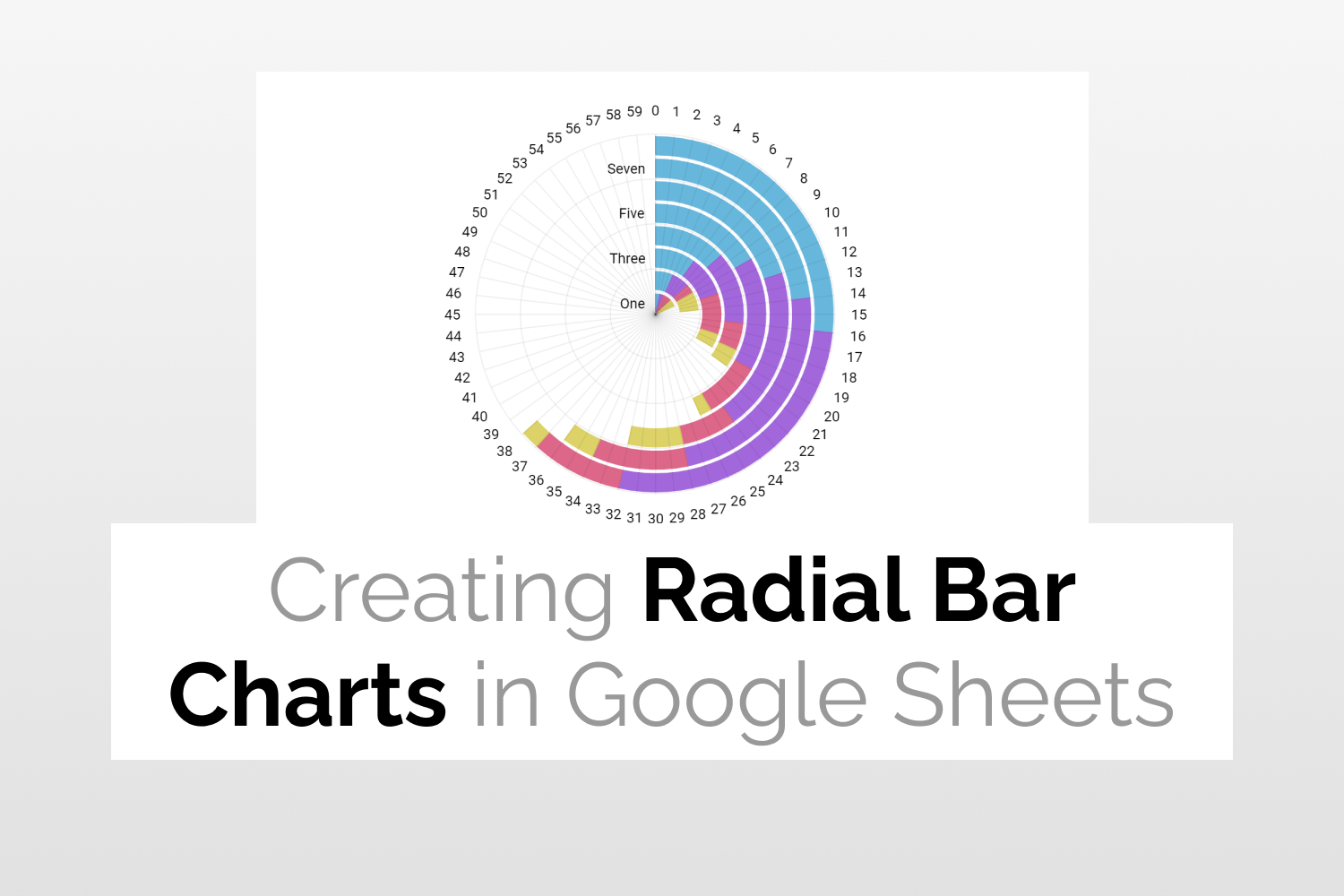
Radial Bar Charts in Google Sheets
Learn how to create Radial Bar Charts in Google Sheets
Introduction
Radial Bar Charts prove to be useful when you want to represent comparisons among different categories in your data. Moreover, this chart is usually preferred when you want to represent/visualize each category as a part of the entire data. Radial Bar Charts in Google Sheets allow you to analyse/compare each separate category with the other categories and also the entire data as a whole.
Radial bar charts should not be confused with Pie Charts. Pie Charts are primarily used to showcase a % distribution (totaling 100%) whereas Radial Bar charts in Google Sheets can be use radial bars of different lengths to show data in a more flexible way.
Preparing the Data
- The data given below shows three products along with their respective quantities.

- Next, we will add two more columns to the dataset- helper and max value. The max value column is the maximum quantity of a product and depicts the value of one full circular rotation.

- The helper column values are a difference of the Max value and Quantity. Moreover, these values depict the empty space in the Radial Bar Chart and are calculated using the following formula:
=D2-B2

- Our final dataset looks like this.

Now let’s move on to creating the Radial Bar Chart.
Adding the inner circle
- Select the quantity and helper columns from the first row of your dataset.

- Click Insert -> Chart.

- From the Chart Editor, select the Doughnut Chart.

- Click on Customize tab.
- Under the Chart Style section set the background color and chart border color to None.

- Under the Pie Chart section, set the Slice label and border color to None as well. Adjust the Doughnut hole size. Here, I have set it to 67%.

- Remove the chart title.

- Set legend to None.

- Set the color of Slice 2 as None. The Slice 2 portion here depicts the helper value and needs to look transparent.

- Under the Setup tab ensure that the Switch rows/ columns option has been selected.

- Your inner circle chart looks like this.

Adding the middle circle
- To create the middle circle, select the data from the second row and follow the same steps as above.
- The only difference here would be changing the chart color and Donut hole size. I have set these to Yellow and 77% respectively.
- The chart now looks like this.

Adding the outer circle
- Select the data from the third row and follow the aforementioned steps.
- Changing the chart color and Donut hole size. Here, I have set these to Orange and 81% respectively.
- The chart now looks like this.

Adding labels to the circles
- Click on Customize -> Chart and axis titles.
- Select Chart Subtitle. Type the label in the title text input box.
- To demonstrate this I have added a data label to the outer circle. I have also set the title format to Bold and changed the title text color to Black.

- After following the above mentioned steps you can add data labels to the other circles as well.
Creating Radial Bar Charts in Google Sheets
- Stack all the three charts and adjust them such that they all have the same center.
- Your Radial Bar Chart is now ready and looks like this.

Adding Chart title
- Click on Customize -> Chart and axis titles.
- Select Chart Title. Type the title in the title text input box.
- I have also set the title format to Bold and changed the title text color to Black.

- Your Radial Bar Chart will finally look like this.

See Also
- Gantt Charts in Google Sheets: Learn how to create Gantt Charts in Google Sheets.
- Tree Map Charts in Google Sheets: An easy guide to help you create Tree Map Charts in Google Sheets.
- Waterfall Charts in Google Sheets: More on how to generate Waterfall Charts in Google Sheets.
- Candlestick Charts in Google Sheets: Quick guide to teach you how to create Candlestick Charts in Google Sheets.
