Quick Guide
To create a bell curve in Google Sheets simply follow the steps below:
Step 1: Calculate the mean
Step 2: Calculate the standard deviation
Step 3: Calculate the lowest and highest values for the sequence
Step 4: Calculate the sequence
Step 5: Calculate the normal distribution
Step 6: Create the bell curve: select the normal distribution values→Insert→Chart→Line chart
Overview
Bell curves also known as normal distribution curves are used to represent the normal distribution of a given sample of data. The curve has the symmetrical shape of a bell due to the placement of its data points.
Normal distribution or Gaussian distribution is widely used in a variety of fields to visualize data. In a normal distribution, the majority of data points are around the mean with fewer points spreading out the edges. The measure of the distance between these edges and the mean is referred to as the standard deviation. Popular applications include:
- Height of people
- Academic performance
- Measurement errors
The two factors that influence the normal distribution are the mean (average value) and the standard deviation (spread). Once we calculate the mean and standard deviation, we will use a Google sheets formula NORMDIST to obtain the normal distribution.
Syntax
We’ll use the following syntax to calculate normal distribution with which we can create a bell curve.
=NORMDIST(x, mean, standard_deviation, cumulative)- x is the input to the normal distribution
- mean is the average value obtained using the AVERAGE function, =AVERAGE()
- standard_deviation is the standard deviation of the normal distribution
- cumulative signifies whether to use the normal cumulative distribution function or the distribution function
In this guide, you will learn how to create a normal distribution in 6 easy steps. We will use the table of data below which represents the scores in an online game.

We will calculate
- the mean value
- standard deviation
- and the sequence needed to plot the data points on a graph
Let’s begin!
How to create a bell curve in Google Sheets
Creating a bell curve in Google Sheets is simple, as you will see. We just have to obtain data points using a few formulas and then Google Sheets will do the rest. To proceed, let us first get all the data needed for the curve: the mean, the standard deviation, and the sequence.
Make a copy of the spreadsheet used in the tutorial. Click here.
Step 1: Calculate the mean value to create a bell curve in Google Sheets
We are going to calculate the average value of our data range. To do this we will use the AVERAGE formula.
Syntax of the AVERAGE function in Google Sheets
=AVERAGE(value1, [value2, ...])Where the parameters are the range of values.
- Type in the formula in an empty cell and
- Select the range A3:A19 representing our data as input for the formula
The formula is as given below:
=AVERAGE(A3:A19)
With our mean in place, let us head over to calculating the next value we need to create a bubble chart, the standard deviation.
Step 2: Calculate the standard deviation to create a bell curve in Google Sheets
The standard deviation as we recall is the spread between the edges of the curve. It is a measure of variance; the deviation from the mean. Google Sheets provides another handy formula that we can utilize to get the standard deviation of a given set of values. The STDEV.P function
Syntax for standard deviation
= STDEV.P(value1, [value2, ...])Where the parameters make up the range of values we intend to determine its standard deviation.
Here’s how we find the standard deviation in Google Sheets:
- In an empty cell, type in =STDEV.P(
- For the range, we will select the same data range A3:A19
So the complete formula is
=STDEV.P(A3:A19)
And that’s the standard deviation calculated. On we go the next step: finding the maximum and minimum values.
Step 3: Generate the max and min X-values
According to the empirical rule of standard normal distribution, 99.7% of data points will fall in between +/-3 standard deviations of the mean.
Since we have the mean and standard deviation, we simply need to do a simple calculation to determine the maximum and minimum X- values i.e points on the x-axis. This will be needed for the sequence we will generate in the next step.
We will use the formulas below to find the minimum and the maximum X-values.
Xmin = Mean – standard deviation*3
Xmax = Mean + standard deviation*3
Enter the formula below for the Xmin.
=B3-3*C3
Formula for Xmax
=B3+3*C3
Step 4: Generate the sequence to create a bell curve in Google Sheets
Every graph needs a sequence. To plot points, we need to distribute them properly. Using the values we got in the step above we will generate points that will serve as the sequence for our curve. To do this we will use the formula below:
=SEQUENCE ((Xmax - Xmin) + 1, 1, min)In our case the above formula becomes
=SEQUENCE((E3-D3)+1,1, D3)Enter the formula above and press Enter.

We are gradually getting to the finish line.
Step 5: Calculate the normal distribution for the bell curve in Google Sheets
The final step in setting up the data for our bell curve is to calculate the normal distribution with the values we have obtained so far. We will use the NORMDIST Google Sheets formula.
=NORMDIST(x, mean, standard_deviation, cumulative)To generate an array we will be using the NORMDIST inside an ArrayFormula.
Therefore, enter the values as follows:
= ArrayFormula(NORM.DIST (F3:F12, B3, C3, FALSE))
Now that we have our sequence and all other values we need to create a bell curve in Google Sheets, it’s time to get to the fun part of it.
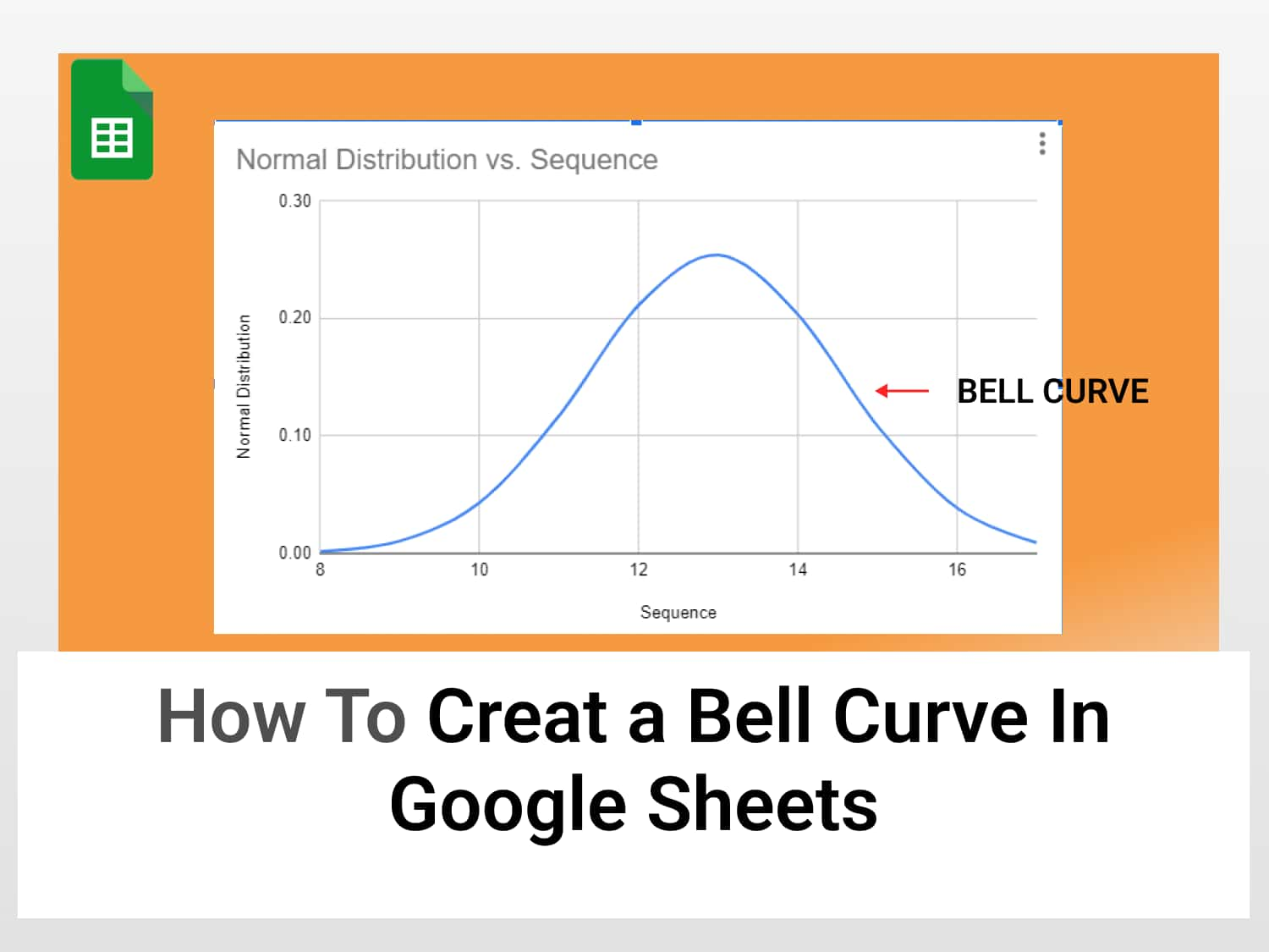
Step 6: Create the bell curve in Google Sheets
With the mean, standard deviation, and sequence all calculated, and hence, the values of the normal distribution, creating the bell curve is but a few steps away.
Here are the steps:
- Highlight the data range, which is the normal distribution values
- Go to Insert and select Chart

- Find the Smooth line graph from the chart options

- Select it and the data will be rendered in the form of a bell curve as shown below:

There you have it: a bell curve created in Google Sheets.
Customizing the bell curve in Google Sheets
As with every chart in Google Sheets, there are certain customization options available for our curve. You can change the colour and size for instance.
To customize the curve and make it more visually appealing, follow these steps:
- Click on the three dots at the top right corner of the curve
- Select Edit chart to open the chart editor menu

- Then choose the Customize pane, here you will see options for colour and size.
To change the background colour: Go to Customize ➡ Chart Style ➡ Background colour.

And that’s it. We have created a bell curve in Google Sheets and also customized it to look better.
Conclusion
It’s easy to create a bell curve in Google Sheets. We just need the mean, standard deviation, and Sequence to generate our normal distribution.
See also
There are other similar articles on making great-looking charts in Google Sheets in our blog, check them out:
How to create a Pareto chart in Google Sheets