What is a Funnel Chart?
A funnel chart is an inverted pyramid type of chart. The chart is mainly used for representing the progress of interconnected stages of a process. The chart is used to visualise the purchase trend at every step of the funnel.
Why use a Funnel Chart in Google Sheets?
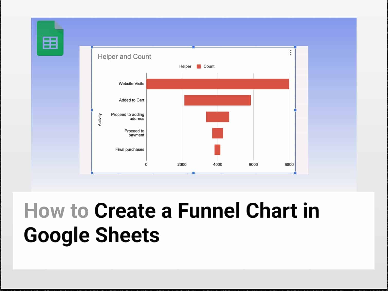
Let’s say you have some 1000 visits to your website. You see that 500 visitors are adding a particular product to their cart. You will see that out of 500, only 300 have added a delivery address. Now, out of the 300, only 150 have added payment details. Finally, of the 150 visitors, only 75 go on to purchase the final product.
Here, you can see that the count of customers has decreased at every proceeding step of the purchase. If you want to visualise the trend, it is preferable to use a Funnel Chart in Google Sheets. Funnel charts in Google Sheets are primarily used in sales or business processes to track the drop in customers at every stage.

If you want to know more about Funnel Chart in Businesses, you can go through this Oracle Netsuite article.
How to use a Funnel Chart in Google Sheets?
Step 1: Open Google Sheets
- To create a funnel chart in Google Sheets, open a Google Sheet and enter the data you want to visualise.

Step 2: Insert Helper Column
- Since there is no provision to create funnel charts directly, we will need a helper column to make a funnel chart in Google Sheets.
- Insert a Helper column between Labels and Count.
- Select Counts column → Right-click → Insert 1 column to Left → Name it Helper.

- Now, use the following formula to enter values in the Helper column:
=(max($C$2:$C$6)-C2)/2
- Here, the formula determines the maximum value in our column, subtracts the corresponding count value and takes the average.

- We add the helper column to give a funnel type representation to our chart. The helper data and count data will be stacked on each other. Things will get easier to understand going ahead.
Step 3: Insert Stacked Bar Chart
- Now select the entire dataset by pressing Ctrl + A (Windows) or Cmd + A (Mac).

- Go to Insert → Charts.

- A stacked bar chart will be created.

Step 4: Remove the Helper Column
- The helper column was added to create a funnel type graph.
- Now, it’s time to remove the helper column.
- Go to Chart Editor → Customise → Series.

- Click on the drop-down menu and select Helper.
- Set the Line Opacity to 0%.

- You will see that the helper column has disappeared from the graph.
- Congratulations, you have successfully created a Funnel Chart in Google Sheets.
Conclusion
Funnel Chart in Google Sheets is a helpful tool to visualise the progress of interconnected steps of a process. You have to take the help of a helper column to create a Funnel Chart in Google Sheets. We hope this funnel charts guide helped you.
See Also
Want to know more formulas and functions in Google Sheets? Look at our definitive guide on Google Sheets which covers hundreds of such topics here. Enjoy reading!
Filter Data by Color in Google Sheets: In this article, we would have a look at how to Filter Data by Color in Google Sheets.
Using GOOGLEFINANCE to Convert Currency in Google Sheets | 2 min easy guide: In this article we would see how to convert currency in Google Sheets on a real-time basis using Google Finance.
Complete Guide on the REGEXEXTRACT Function in Google Sheets for 2022: Learn how to use the REGEXEXTRACT function in Google Sheets and its variations.
Google Sheets: How to Use Pivot Tables: Learning how to create and use Pivot Tables for analysing data in Google Sheets.