In the past couple of years, you must have frequently come across graphs showing the spread of coronavirus across populations–and how fast it is spreading. They show exponential growth. They are called semi-log graphs–called so because one variable grows exponentially while the other increases linearly.

Key concepts:Semi-log graph: A semi-log graph has one axis on a logarithmic scale and the other on a linear scale.Log-log graph: In a log-log graph, both the x-axis and the y-axis are logarithmic.
Semi-log graphs are useful in various cases and across various areas–from biology to finance, physics to demography, mathematics to the growth of cancerous cells, amongst many others. Understanding and, also equally crucially, learning how to create graphs depicting exponential growth is therefore essential.
So, we are going to learn how to create a semi-log graph in Google Sheets.
How to create a semi-log graph in Google Sheets
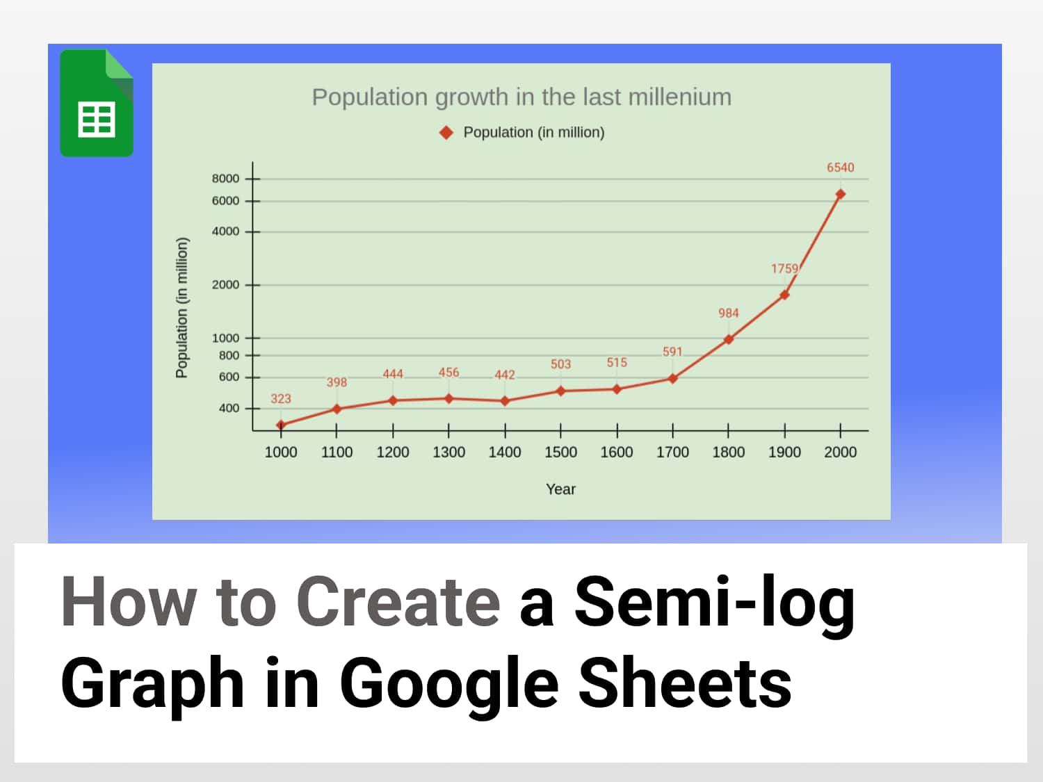
To make a semi-log graph in Google Sheets, let us consider the growth of the human population from the year 1000 to 2000 using data from here.
You can make a copy of this Google Spreadsheet document for a hands-on experiment.
Step 1: Entering the data
We enter the data in two columns, one for year and one for population.

Step 2: Inserting the chart
After labelling the columns and entering the data, select the data range along with the labels.
Then go to the “Insert” tab and select “Chart”.

Google Sheets will then insert a chart it thinks fit depending on the data–a semi-log graph is unlikely to be it; so we need to modify the chart.
Step 3: Setting up the chart
The chart that is inserted by default may not be what we want. What we desire is a line chart to depict the semi-log graph. So, we go to the “Chart editor” option on the right of the screen and select “Line chart” under the “Chart type” dropdown menu.
Also check the options “Use row 3 as headers”, “Use column A as labels”, and “Treat labels as text”.

Step 4: Adding the semi-log graph in Google Sheets
Go to the “Customise” tab and expand the “Vertical axis” option. Here select the “Logarithmic scale” checkbox and also tick the “Show axis line” checkbox.

Remember 💡Do not forget to mark the checkbox “Logarithmic scale” on the “Vertical axis” tab. This will make the graph semi-log, with the y-axis logarithmic.
Step 5: Customising the chart
In the Customise tab on the Chart editor menu, expand the “Chart style” option and change the background colour, font style and border colour. Then expand the “Series” tab and customise the line colour, opacity, point size and so on. Tick the checkbox beside “Data labels” so that the data are displayed on the graph.

After that, go to the “Gridlines and ticks” option and check the “Major gridlines” and “Major ticks” for both the vertical axis and the horizontal axis.

And so that is how we create a semi-log graph in Google Sheets. Shown below is the semi-log graph Google Sheets that we have created.

Creating a good semi-log graph in Google Sheets – some key points:
- Always keep a light background colour: not too bright or too fancy
- Add data labels and keep the font readable
- Add gridlines to aid the interpretation of the data
- Ensure that the axes are properly labelled
Conclusion
Making a semi-log graph in Google Sheets is a straight-forward process as we have learned. We just need to use the line chart and remember the axis on which the exponential values are placed (usually the vertical axis) and select the logarithmic scale option.
See also
Here are some more articles that you might find helpful:
How to Create a Funnel Chart in Google Sheets – 4 Min Easy Guide