In this article, we’ll learn how to create heat maps in Google Sheets using conditional formatting and explore options to style the heat maps.
Visualizing Data Using Heat Maps in Google Sheets
You can visualize your data table by creating heat maps using conditional formatting, which are graphical representations of data that utilize color-coded systems.
- In this article, we will run through how you can create heat maps in Google sheets using conditional formatting.
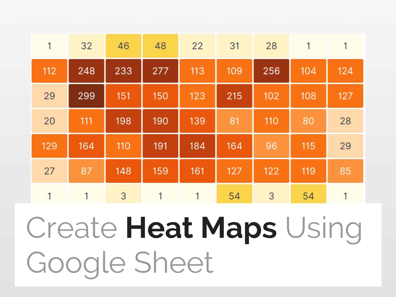
- If you follow the steps as described in this article, you will get a heat map view as shown below :

Create Heat Maps in Google Sheets in 3 Steps
Step 1: Select and prepare data
- The first step is to select the dataset of interest to create the heat map of.
- Keep in mind that you do not have to select the column and row headers, just select the data of interest.
- Select cell B3 and drag the selection down to F9.

Step 2: Insert Conditional Formatting
- After selecting the cells, click on the Format button on the navigation bar.
- Select Conditional Formatting.

Step 3: Create a multicoloured heat map
- Click on the Color scale tab.
- Select Default to choose the colour styling you want for your heat map
- On the left, you can see a bi-coloured heat map based on the min-max value of the dataset.


Styling the Heat Maps in Google Sheets using Minpoint-Maxpoint
- Select the Minpoint drop-down menu and explore options.
- We are using Min Number as the criteria. You can visualize the heatmap by choosing various options such as Number, and Percentile.
- You can select the colour you want to assign to minimum values.


Using other parameters to style the heat map
- Just like how you styled the heat map using Minpoint, you can do the same using Midpoint and Maxpoint drop-down menus.


See Also
Here are some related articles that you may find useful:
https://blog.tryamigo.com/gantt-charts-in-google-sheets/
https://blog.tryamigo.com/create-an-organizational-chart-in-google-sheets/