You’re going to learn how to create a graphical representation of Linear Regression using Google Sheets. Formulate linear relationships between variables.
Why use Linear Regression?
Linear regression helps in predicting the value of a variable based on the value of the other variable if a linear relationship exists between them. In this article, you will go through how you can perform linear regression using Google sheets. But before jumping in, the dependent variable is on the Y-axis and the independent variable on the X-axis.
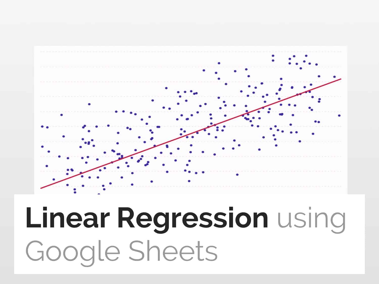
Follow the steps as described in this article to get a graphical representation along with the equation, as shown below:

Steps to Perform Linear Regression
Step 1:- Prepare and select data
- To perform regression, you need to have a dataset with a dependent variable (here Profits) and an independent variable (here Year).
- Select the dataset you want to perform linear regression on.
- Left-click on cell A1 and drag it down to B23 along with the titles of the variable columns as shown below:

Step 2:- Insert Chart
- Now, click on the Insert tab from the navigation bar.
- Select the Chart option to create a graphical representation of the regression.

Step 3:- Create a scatter plot
- Now, navigate to the Chart type drop-down menu.
- Select Scatter chart as the chart type and select the Scatter plot, as shown below :

Step 4:- Customize the graph settings to visualize
- To plot the trend line, select the Customize tab
- Go to the Series tab for plotting the trend line :

Step 5:- Plot trendline, equation of graph, and method used for regression analysis
- Checkmark the Trendline option to see the trend line of the points as seen in the graph below.
- Navigate to the Label drop-down menu
- Select the Use Equation option to display the equation of the graph.
- Tick mark the Show R2 checkbox to demonstrate the R2 value of the graph.
- The higher the R2 value, the higher is correctness to predict any value and fit to the model.

See Also
Plot Multiple Data Ranges on a Single Chart: To plot multiple data ranges on a single graph along with their equations of regression.
Eliminate Duplicates Using Queries in Google Sheets: Learn how to use the Google Sheets Query formula to remove duplicates from the dataset.
References