
How to Create a Normal Distribution Curve in Google Sheets
Learn how to create a Normal Distribution Curve in Google Sheets.
Introduction
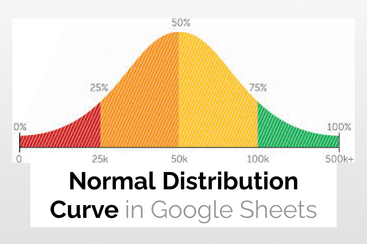
A Normal Distribution Curve is mostly used in statistics to visualize data where most values are close to the mean value while others are away from it. The peak value in the curve represents the average of all the data points. A wide and more spread-out bell curve will have a larger standard deviation, while a steep one will have a smaller standard deviation.
Example Data
The following sample data consists of the height of some plant species. I will use this data to demonstrate how to create a Normal Distribution Curve in Google Sheets.

Creating the Normal Distribution Curve in Google Sheets
Step 1: Calculating some additional values
In order to create a Normal Distribution Curve in Google Sheets you need some additional information such as
- Average
- Standard deviation
- +/- 3 standard deviation values of the average (99.7% of the population lies in this range)
- Range sequence
- Normal Distribution for all the values

I have used the following formulas to calculate the above-mentioned values.
Average:
=AVERAGE(A2:A15)
Standard deviation:
=STDEV.S(A2:A15)
Low Standard deviation:
=B2-3*C2
High Standard deviation:
=B2+3*C2
Range sequence:
=SEQUENCE(E2-D2+1,1,D2)
Normal Distribution:
=ArrayFormula(NORM.DIST(F2:F15,$B$2,$C$2,false))
Following is the result.

Step 2: Select Data
Next select the values in the Sequence and Normal Distribution columns.

Step 3: Insert Chart
Click on Insert -> Chart.

As you can see in the screenshot below, the following chart gets inserted.

Step 4: Change chart style
From the Setup tab of the Chart Editor, select the Smooth Line Chart option.

The following chart is now displayed.

See Also
Waterfall Charts in Google Sheets: Learn how to create Waterfall Charts in Google Sheets.
Tree Map Charts in Google Sheets: An easy guide to help you create Tree Map Charts in Google Sheets.
Radial Bar Charts in Google Sheets: More on how to generate Radial Bar Charts in Google Sheets.
Candlestick Charts in Google Sheets: Quick guide to teach you how to create Candlestick Charts in Google Sheets.