
How to Create a Waterfall Chart in Google Sheets
Learn how to create waterfall charts in Google Sheets.
Introduction
A waterfall chart consists of bars that represent the starting and ending values of any quantity by connecting them using intermediate floating bars or bridges. These intermediate bridges demonstrate how the starting value increases or decreases before reaching the final value. Hence a waterfall chart in Google Sheets can be used to reflect the positive and negative changes taking place in a value over a period of time.

As you can see above, waterfall charts are an excellent way to showcase changes in a data variable over time. Read more on why waterfall charts are special. Waterfall charts can also be used to track marketing goals.
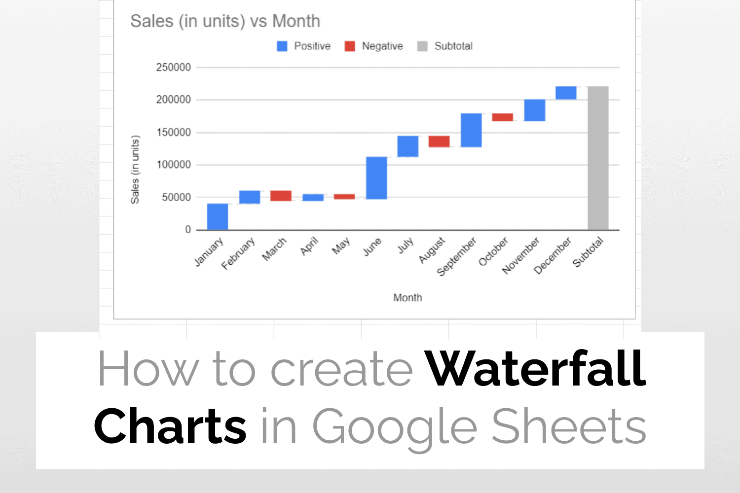
Example data to create waterfall chart in Google Sheets
The following spreadsheet shows the sales made by a company in the past 12 months. In this data, the positive values represent an increase in sales, while the negative values represent a decrease in sales. I will use this data to demonstrate how to create waterfall charts in Google Sheets.

How to create a waterfall chart in Google Sheets
Below is the step-by-step guide on how to create waterfall charts in Google Sheets.
Step 1: Select the data
First, let’s select the data for which we want to create the Waterfall Chart.

Step 2: Insert Chart
After selecting the data, click on Insert -> Chart.

Step 3: Select Waterfall Chart
From the Setup tab of the Chart Editor, select Waterfall Chart.

As you can see in the figure below, a waterfall chart is created.

Step 4: Add connector lines
Under the Chart style section of the Customise tab select the option to Show connector lines. As shown in the figure below, connector lines are displayed on the chart.

Add new subtotals to your chart
Let’s suppose we now want to add the Mid -Year sales as a new subtotal to our Google Sheets waterfall chart. To do this under the select the Add subtotal after last value in series option under the Series section of the Customise tab, and click on the Add new subtotal button.

After this specify the custom label for your subtotal, subtotal type and column index.

As shown in the figure below, the new subtotal bar is added to the chart.

Customizing the waterfall chart
In order to make any customization in the waterfall chart, head over to the Customize tab in the Chart Editor.
As shown in the figure below, here you will find the following options-
- Chart style: This option allows you to change the chart color, font style, add or edit connector lines etc.
- Chart & axis titles: You can add titles to the chart and axis using this option.
- Series: You can format the chart data labels and also add new subtotals to your chart using this option.
- Legend: Changes the position of your chart
- Horizontal axis: Allows you to edit the chart’s horizontal axis.
- Vertical axis: Allows you to make changes in the chart’s vertical axis.
- Grid lines: This option allows you to add and edit grid lines in the chart.

See Also
Gantt Charts in Google Sheets: Learn how to create Gantt Charts in Google Sheets.
Tree Map Charts in Google Sheets: An easy guide to help you create Tree Map Charts in Google Sheets.
Radial Bar Charts in Google Sheets: More on how to generate Radial Bar Charts in Google Sheets.
Candlestick Charts in Google Sheets: Quick guide to teach you how to create Candlestick Charts in Google Sheets.