The SPARKLINE function creates a miniature chart in a cell
Syntax
=SPARKLINE(data, [options])data – The range or array containing the data to plot.options – [Optional] – A range or array of optional settings and associated values to customise the chart.
Sample Usage=SPARKLINE(A2:A6,{"charttype","bar";"max",10})
//This will create a bar chart from the values in cell range A2:A6 with the upper value of the bar chart of 10.

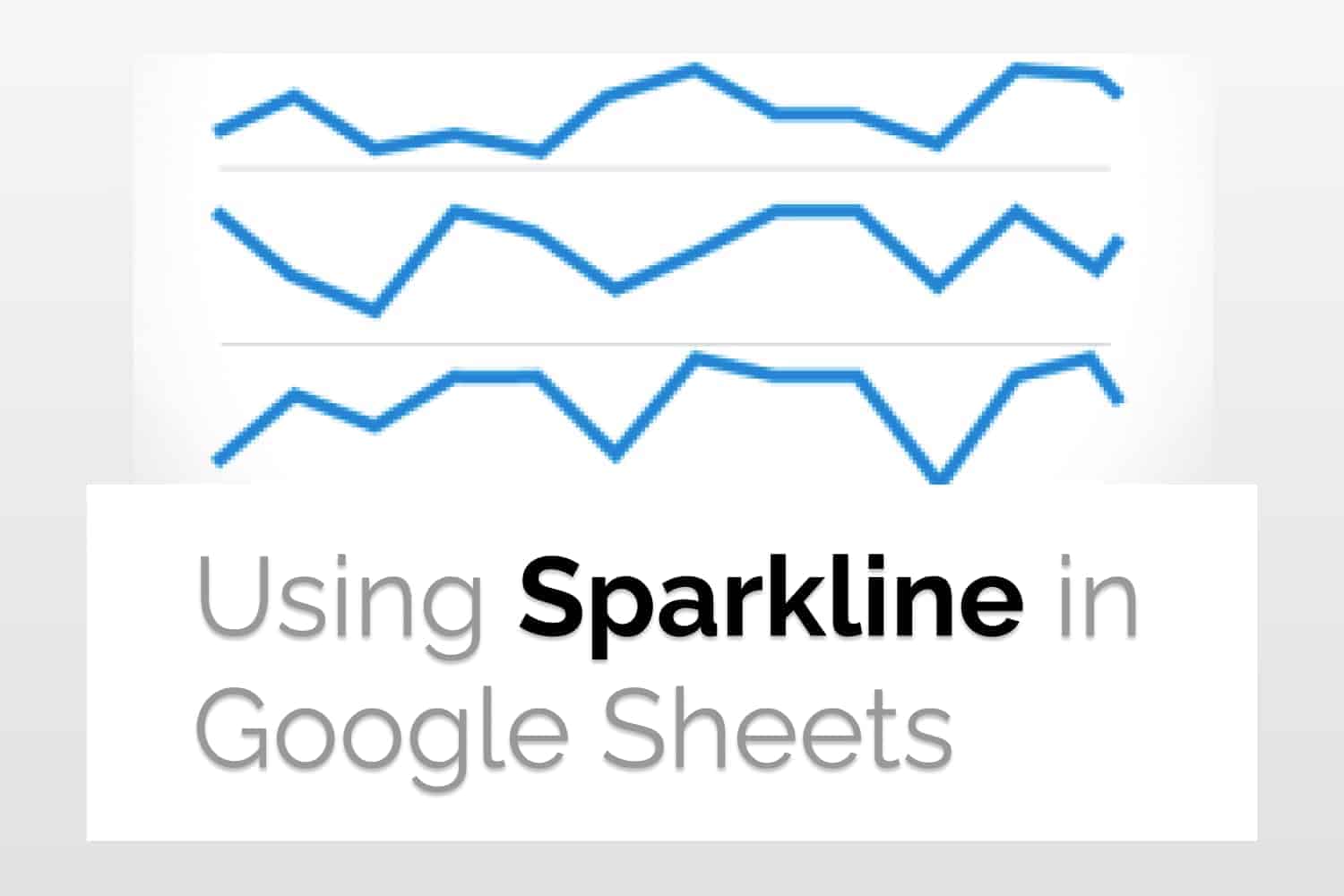
Learn how to use Sparkline in Google Sheets and examples of its usage.
Why Need for Sparkline in Google Sheets
Usually, when working with a large data set, the numbers can be a bit overwhelming, to say the least. It is not easy to quickly grasp what the numbers, trends and slope represent. For example, if there is a chart of stock prices (which may contain many numbers), it may overwhelm you. You won’t be able to quickly tell if prices are going up or down.
In this article, we would use Sparkline in Google Sheets. Sparkline is a one-cell chart that quickly helps you visualize your data and makes it easier for you to get an understanding of the numbers in front of you. In this article, we will be looking into how to implement sparkline graphs. You can read more about sparkline and when should you use it in this article here.
Basic Use of Sparkline
The basic syntax to use sparkline in Google Sheets is as follows
SPARKLINE(data, [options])
Let’s try to make a basic sparkline function. The data can be replaced by the cell range your plottable data is in.

Types of Graphs
The default in a sparkline graph is a line graph. But we can use it for many more type of graphs. Below is the list of types of graphs that we can make.
- line: a line chart(the default)
- bar: the bar chart(co
- column: for a column chart
- winloss: for a type of column chart that plots 2 possible outcomes: positive and negative
The syntax for the same is
SPARKLINE(data, {“charttype”:”[TYPE]”})

Customizations:
Line Charts
You can also customize your line graphs very easily using the optional attributes provided in the Sparkline in Google Sheets. The attributes can have the value as follows.
- xmin: set the min value along the horizontal axis
- xmax: set the max value along the horizontal axis
- ymin: set the minimum value along the vertical axis
- ymax: set the maximum value along the vertical axis
- color: set the color
- rtl: render chart right to left, value can be “true” or “false”
- linewidth: determine the thickness of the line

This way you can customize your line charts using sparkline functions.
Columns and Win-Loss Charts
- color: sets the color
- lowcolor: color for the lowest value
- highcolor: color for the highest value
- firstcolor: color for the first value
- lastcolor: color for the last value
- negcolor: color for all the negative values
- empty: how to treat empty cells, options being “zero” or “ignore”
- nan: how to treat non-numeric data, options being “convert” or “ignore”
- axis: should axis be drawn, options being “true” or “false”
- axiscolor: set the color for the axis
- ymin: custom minimum data to scale height for columns (not for win-loss graph)
- ymax: custom maximum data to scale height for columns (not for win-loss graph)
- rtl: should graph be rendered right to left
An example of its usage would be

Bar Charts
- max: maximum value along the horizontal axis
- color1: first color used in the bar chart
- color2: second alternating color used in the bar chart
- empty: how to treat empty cells, options being “zero” or “ignore”
- nan: how to treat non-numeric data, options being “convert” or “ignore”
- rtl: should graph be rendered right to left
column and win-loss
An example of its usage would be

Conclusion
In this article, we saw how to use sparkline in Google Sheets. If you’re working with a large set of data, using sparkling, it becomes very easy to visualize it without taking a huge space from your work window.
See Also
Want to know more formulas and functions in Google Sheets? Look at our definitive guide on Google Sheets which covers hundreds of such topics here. Enjoy reading!
Google Sheets: BINOMDIST Function: Understand how to use the BINOMDIST function in Google Sheets
Numbers of Days, Months and Years between two dates: Number of Days, Months and Years between two dates