
Get started with Conditional Formatting in Google Sheets
Need for Conditional Formatting In Google Sheets
When you’re working with huge tables, all the data can be very overwhelming. Hence we have graphs and charts to help us visualize our data. But we can also visualize our data with colors. It is very effective in keeping track of the magnitudes of the data visually. We will have a basic look at Conditional Formatting in Google Sheets. You can check this article which talks about the advantages Conditional Formatting provides you with.
Basic Use of Conditional Formatting in Google Sheets
Let’s imagine you are a teacher and you have a huge list of students in front of you which looks something like this.

Let’s say you want to know in a quick look, regarding which students are scoring below 75. It is easily achievable using conditional formatting. Just select the column (Marks in this case) then go to Format-> Conditional Formatting. A sidebar like such should open up.

Let’s first have a look at the single color tab only. The first field is “Apply to range”, as the name suggests this is the range for which you want to make changes.
In the second field, “Format cells if” we get a selection of various conditions such as less than, greater than, starts with as well as option to define a custom formula.

Let us choose less than and enter the value 75 so we make clear that we want to change color for values below 75. After that, choose a color, in this case, we would choose red and hit done.

Color Scaling in Conditional Formatting
You can also color scale your data. For example. The students with better marks will have marks in a darker green shade and students with lower grades will be redder.
To do so let’s select the column again, open the conditional formating window and choose Color Scale tab.

This is the Color Scale window. We have multiple options here- let’s go through them one by one.
- Min point- You basically choose the value and color for your minpoint here. You can choose the value in many ways for eg. min value, percent, percentile. Here we will choose minvalue which means we choose the minimum point as a reference for the value hence our minimum point would have 100% intensity of this shade. For our current example, let’s choose the color red.
- Mid point- It is the same as minpoint except for the apparent fact that we have to choose the value and color for the mid-point here. For our current example, we will keep this as null
- Max point- The color and reference value for the max point we will be choosing, all the values exceeding the max point(the value that you set here) will have the same color. For our example, we will choose green here.
After these changes, our sidebar would look something like this.

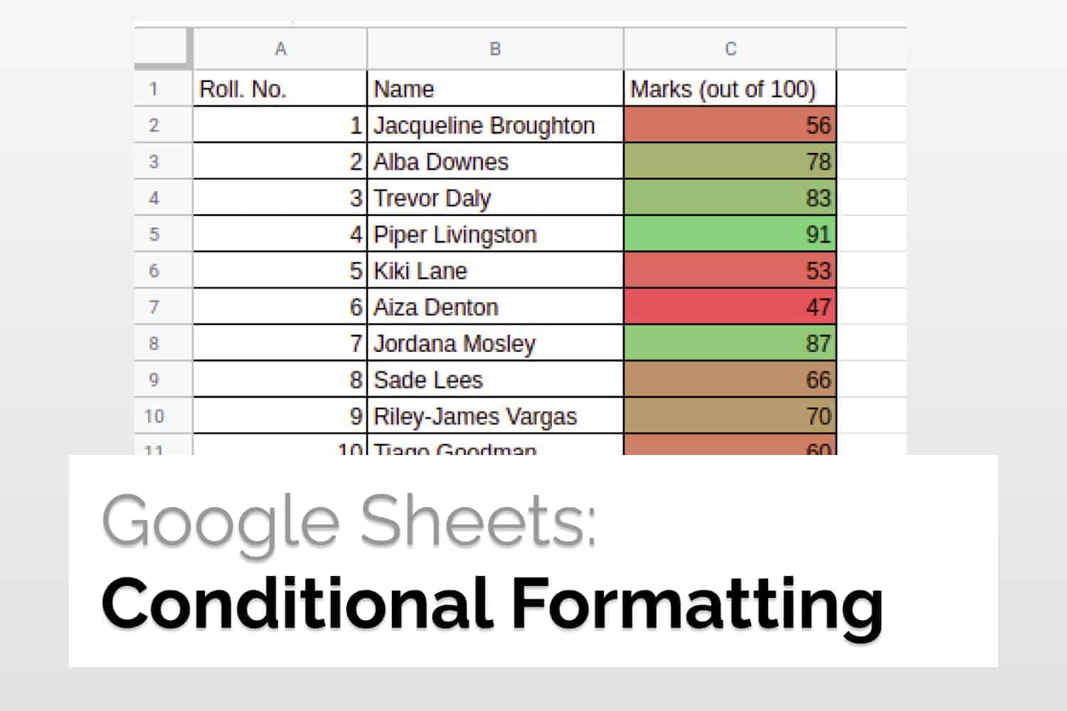
And our table would look something like this

You can see our highest value(91) is painted green while our lowest value(47) has the pure shade of red.
Conclusion
In this article, we saw the basic use case for Conditional Formatting in Google Sheets. If you’re working with a large set of data, using color formatting it becomes very easier for us to identify data patterns and quickly identify the magnitude of values using colors. You can also overlay multiple formatting conditions on top of each other as well.
See Also
How to create Heat Maps: Understand how to create Heat Maps using Conditional Formatting in Google Sheets
Numbers of Days, Months and Years between two dates: Number of Days, Months and Years between two dates