Quick Guide
A step-by-step guide to creating a Radar Chart in Google Sheets
1. Prepare the dataset, specifying the column and row headings
2. Select the data, navigate to Insert→ Click on “Chart”
3. Double click the chart
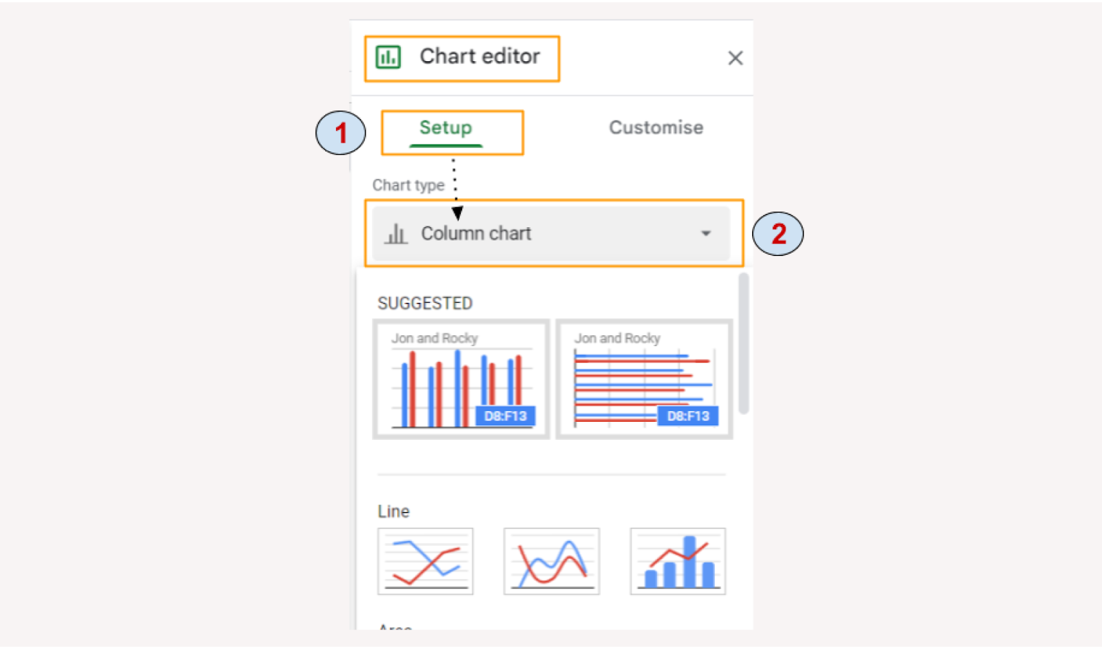
4. Under Setup→Chart type→change from “Column chart” to Radar Chart
Hurray! You have been successful in creating a Radar Chart in Google Sheets from scratch.
Get the sample spreadsheet here
Data is as good as the chart that one uses to present it. The use of irrelevant charts ends up aggravating the problem, rather than solving it. Hence, it becomes extremely important for users to know how to create different charts and prudently choose the right chart to represent the required information effectively and smoothly.
- When to use a radar chart
- When not to use a radar chart
- Steps to create a radar chart
- Customising the chart
When to use a radar chart
There are several charts that one can create using Google Sheets. One such chart that can be created effortlessly in Google Sheets is the Radar chart. Radar charts, also known as spider charts, prove to be extremely useful when comparing two or more variables on different parameters. For instance, when
- Comparing student grades
- Comparing two or more products
- Reviewing budget vis-a-vis spending
- Analyzing the results of a survey
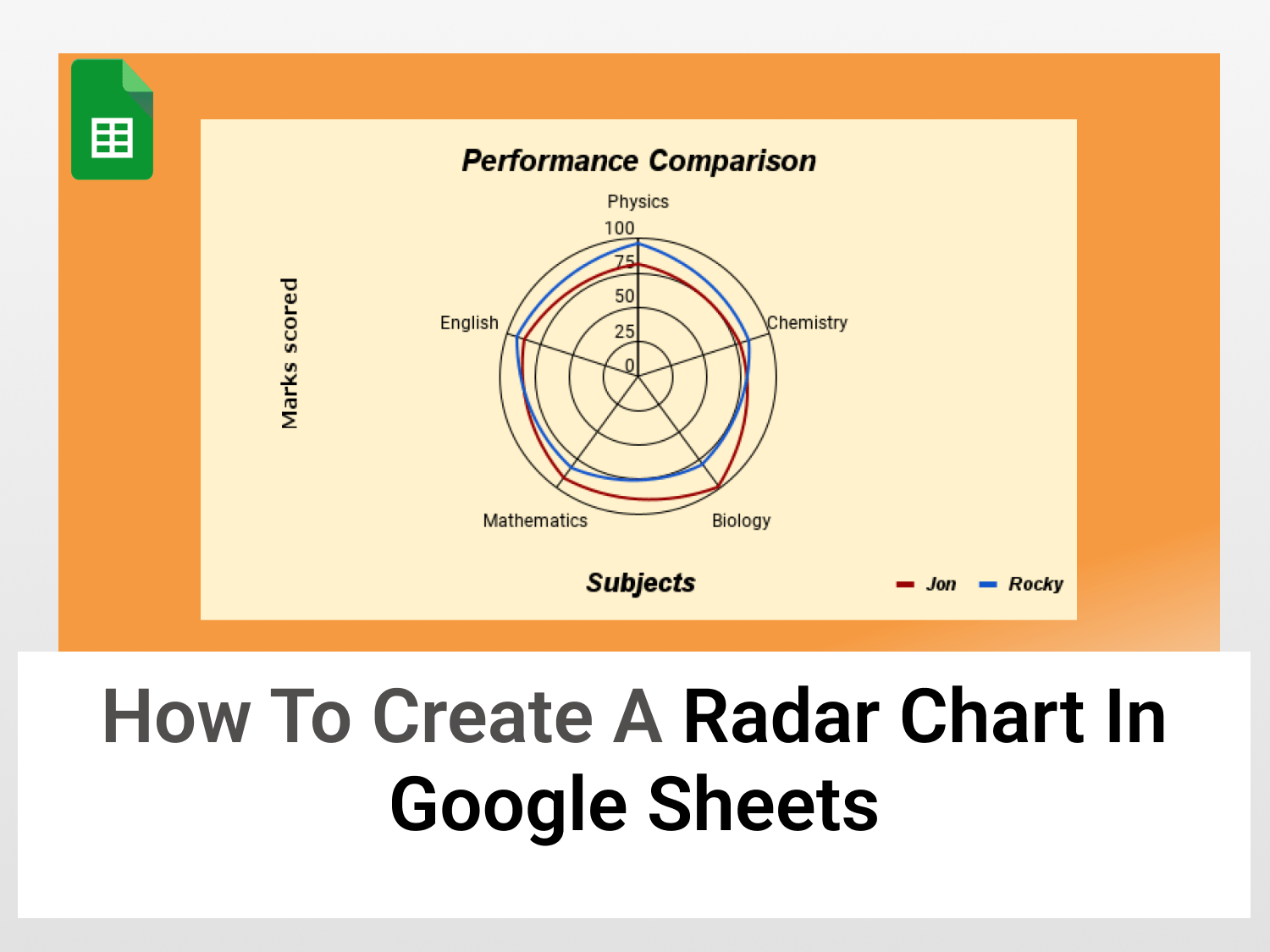
In the example below, we will be comparing the performance of two students, Jon and Rocky, in Physics, Chemistry, Mathematics, Biology and English.

When not to use a Radar chart
While a radar chart may be helpful in a lot of situations, it may not always be wise to represent your data using it because it can get cluttered which will defeat the purpose.
Thus, a radar graph in Google Sheets should NOT be used when:
- There are more than 3 data sets.
- There are more than 12 factors in one chart. Each factor takes up space, and as the number of factors increases, the data loses its appeal.
Steps to create a Radar Chart in Google Sheets
Prepare the dataset
Arrange the dataset in a table-like manner with specified headings to increase the visibility of the radar chart in Google Sheets. The variables that need to be compared are arranged in columns while the parameters are mentioned in different rows.

Insert a chart
- Select the range comprising the data and create a chat. There are two ways to do so:
- Navigating to Insert tab→ Chart.
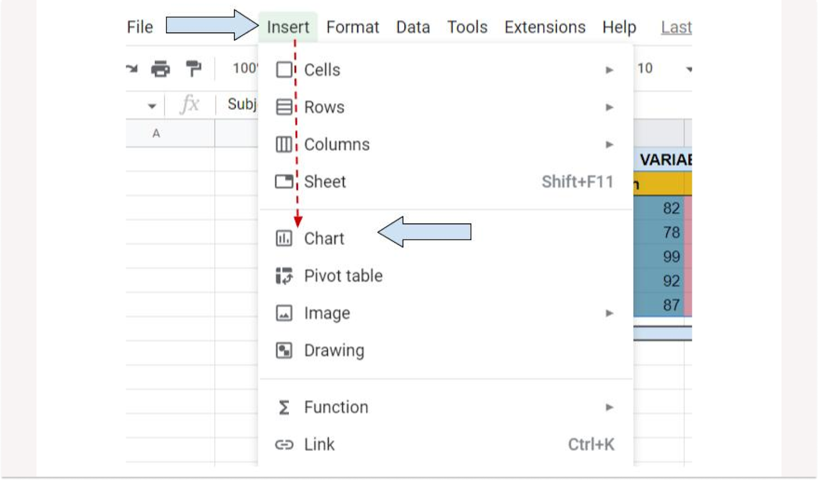
- Or, click on the Chart icon located in the menu bar

- At the end of this step, you should have a bar chart similar to the one below visible on your screen.

How to make the radar chart in Google Sheets
- Double click anywhere on the chart, and once the Chart Editor window opens up, navigate to Setup→Chart type→click on Column Chart. A list containing different charts show up.
- Scroll down till the end and click on the Radar Chart image found in the Other section.
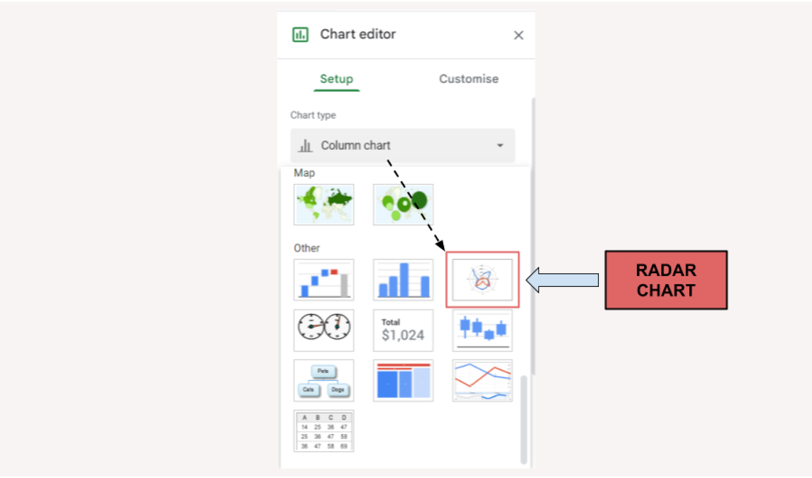
- Once you are done, you will have successfully created a Radar chart in Google Sheets.
Editing a Radar Chart in Google Sheets
To make the chart look more appealing to our eyes, we can double-click the chart and navigate to the customise tab to enhance the way our radar chart looks.
Chart Style
→ The chart style section allows you to change the background colour of the chart along with its outline and font.
→ You can check the Smooth box if you want the lines representing each student’s marks to be straight.
→ The Maximise box can be checked to stretch the chart to fit the box in which it is enclosed.

Chart and axis titles
→ On clicking the chart title, you will find other options that allow you to modify the horizontal axis and the vertical axis titles. It also allows you to add a subtitle to your chart.
→You can use this section to change the colour, and size and modify the text of the titles in your Radar chart.

Series
→ The series tab allows you to modify the lines that represent each of your variables. From the thickness of the lines to their colour, you can use this section to distinguish between the variables you are comparing.

Legend
→ This section can be used to change the colour, font and position of the legend of the chart.

Vertical Axis
→ This section allows you to change the scale factor of the chart and modify the number format of the numbers visible.

Gridlines and ticks
→ This section allows you to decide whether you want the lines in the background to be visible or not.
→ It can also be used to modify the color of the gridlines that appear.
→ The vertical axis in this section has more axis because there are 5 subjects on the basis of which a comparison is to be made.
These are some sections which you can modify in your Radar chart to enhance its beauty and increase its legibility.
After making modifications displayed in each section, the new radar chart produced is shown below.

Conclusion
A radar chart in Google Sheets can be an effective way to make quick inferences regarding the performance of two or more variables on the basis of different parameters.
Thus, the next time you are comparing your result with your friends after an exam, use this chart to brag about your marks in front of them. You can learn to create more such charts through our blog.
See Also
Here are a few other articles that you can refer to and enhance your command over the different features available in Google Sheets.
How to create a Pareto chart in Google Sheets