
In this article, we would have a look at how to insert Geo Charts in Google Sheets for given set of data.
Introduction
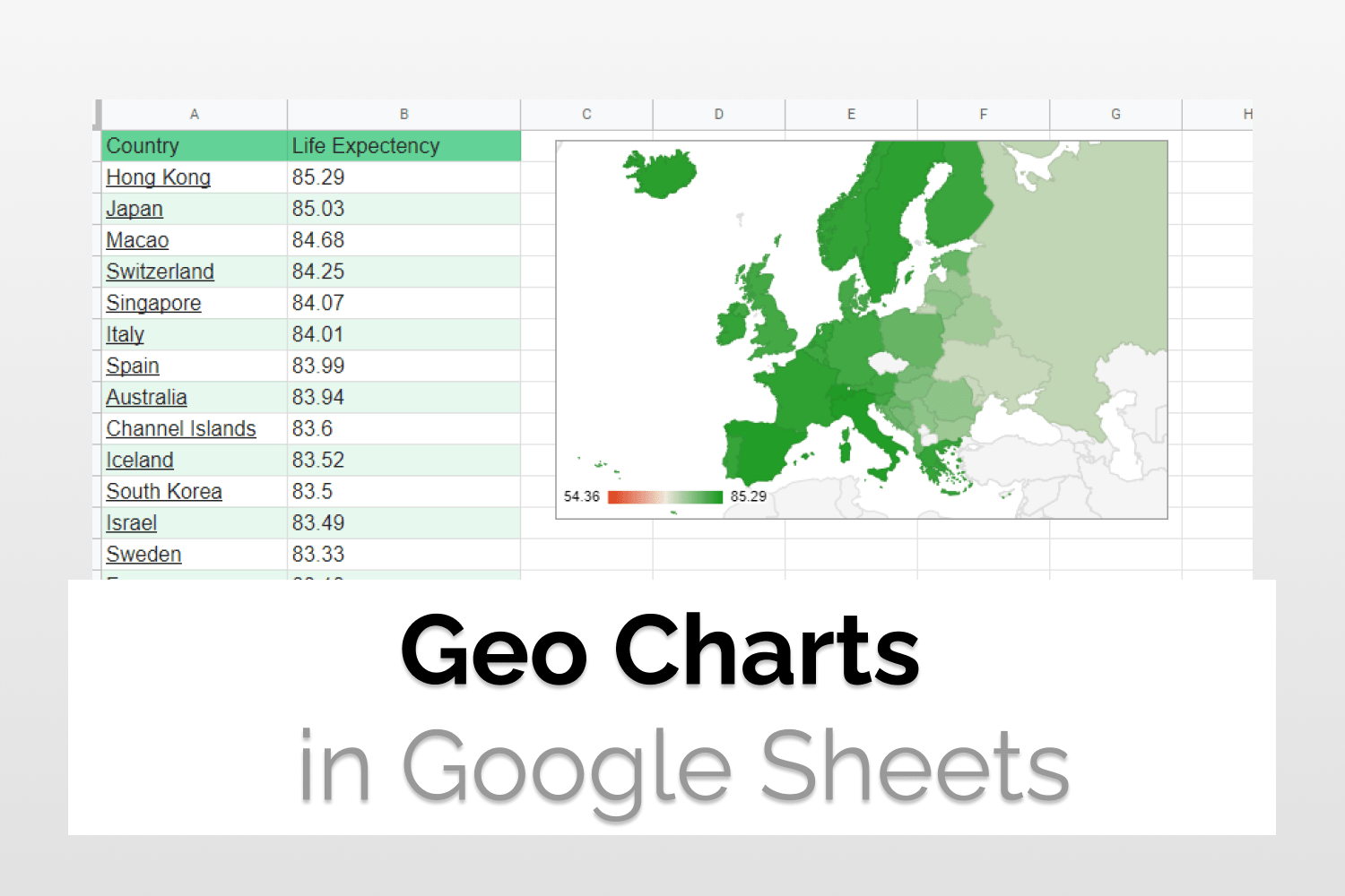
If you have data for a lot of countries so it’s a good idea to represent it using Map or Geo Charts in Google Sheets. Here we have used data for the life expectancy of countries(2022).

Data Preparation
The data needs to be two columns with the first column as the geographic location. Country codes would also work for this. The second column needs to be a numeric value that you want to display. Select the entire row(Including the Header). Then go to Insert>Charts.

Select the Chart Type
By default, some other chart might be selected. Go to the Chart Type dropdown and select the given chart(Geo Chart).

Setup the Graph
A sidebar opens up, let’s have a look at the given options. The data range is the table you want to extract data from. Region is the column in which you want to extract the region names (Countries in this case). Color is the name of the column you want to extract numerical data from.

Customize the Graph
Geo Charts in Google Sheets allows you to customize your graphs. “Chart Style” contains options which are fairly easy to understand, borders and colors etc. “Geo” contains some essential settings. Here you can select colors for the minimum, mid and maximum values. You can also choose color for the countries you don’t have data for.

Analyze the charts
The chart consists of a world map with the countries in shades of colors. Currently, we have set min as red and max as green. So better data points get progressively greener. The legend mentions the min and the max value.

Change the Region
Geo Charts in Google Sheets also allow you the option to change the region. Suppose you have data for European countries. Then you can go to Customize Chart>Geo>Region to choose the preferred region.

Geo charts with markers
Lets say you want to represent countries using markers rather than color code. You can use Geo Charts with markers for the same. Just change the chart type to “Geo Charts with markers”. You can then use same color for all data points since the quantity would be denoted by the size of the marker weather than the color. But you can still use colors if you want to.

Conclusion
We saw how to insert Geo Charts in Google Sheets. We also saw how to customize it with various options in a detailed manner. You can also check Candlestick Charts, another type of specialized chart here. You can check out the official documentation for the Geo Charts here.
See Also
You can checkout other equally good articles on Google Sheets here.
Delete Empty rows in Google Sheets: Learn how to use Slicers in Google Sheets and its variations.
Delete Empty rows in Google Sheets: In this article we would see how to delete empty rows in Google Sheets using two different ways.
How to group rows in Google Sheets: We will learn how to group rows in Google Sheets. We will also have a look at nested grouping.
How to import JSON in Google Sheets: See how to work with JSON using Apps Script Editor. Convert JSON data from a URL to Google Sheets table.
Using Vlookup and Hlookup together: Learn how to reference data from other sheets in Google Sheets including sheets from a different spreadsheet file.